PACKAGING & BEVERAGE / ARTICLE
A label has one job. Get picked up.
Attention is the opening move. Clear information and a believable brand have to follow.
BY BRENT DUCHARMECREATIVE STRATEGIST & DESIGNER
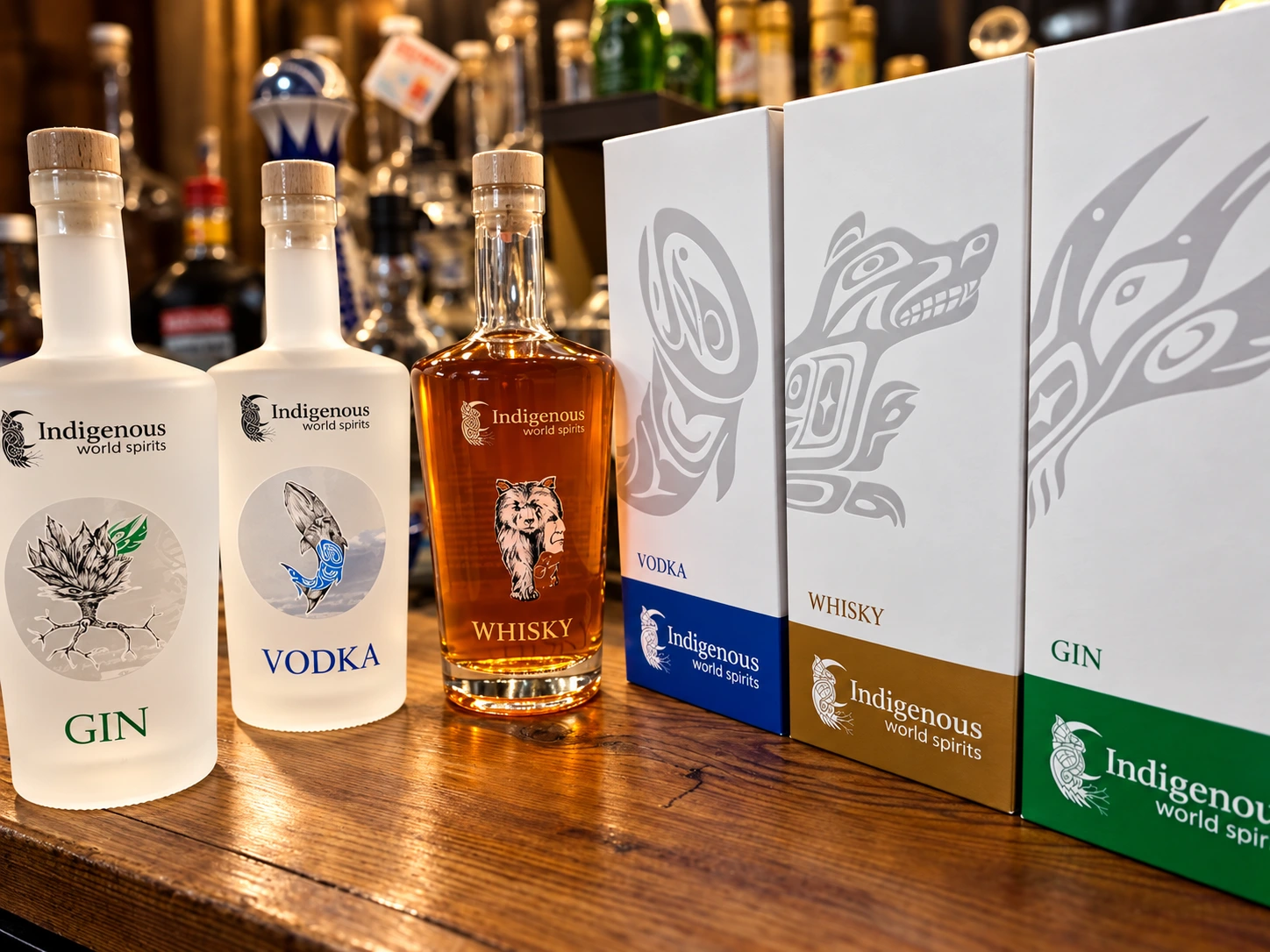
A second look is an opportunity.
The headline is deliberately cheeky. A label has several jobs: it needs to attract attention, identify the product, communicate something about the brand and carry accurate information.
But if nobody notices it, the rest of that work may never get a chance. That doesn't mean the loudest package wins. It means the design needs a clear reason to be looked at.
That reason might be a confident colour, an unexpected illustration, strong lettering or a material that feels right for the product. The choice should come from the brand rather than a desire to add one more effect.
Tell people what they're looking at.
Customers shouldn't have to solve a puzzle to identify what you're selling. The brand, product name and essential product information need a sensible order.
A lovely script can become a problem when the important words are hard to read. A complicated background can compete with the name. Too many equally bold elements leave the eye without a place to begin.
Test the design at its actual size. Step back. Look at it in the setting where it will appear. If you only judge a label enlarged on a screen, you're judging a different experience.
Think in ranges, not isolated masterpieces.
One label can look excellent alone and create confusion beside another product from the same brand. Colour, naming and composition need to help people distinguish the range while recognizing its connection.
Decide which elements stay consistent and which can change. A logo position, a repeated shape or a type system may carry the family resemblance. Colour and illustration may give each product its character.
Also leave room for growth. A design system that only accommodates the first three products can become expensive to untangle when a fourth arrives.
Make the promise believable.
Premium doesn't automatically mean black and gold. Friendly doesn't automatically mean cartoon lettering. The design should suit the product, its audience and the experience you intend to offer.
Finishes and materials deserve the same scrutiny. Foil, texture or a metallic effect may contribute something useful. They can also add cost without improving the message.
Ask your producer about samples and limitations. The physical result matters more than the effect in a mockup.
Check the details before they become inventory.
Confirm the product copy and any required information with the appropriate people. Check the barcode, dimensions and printer specifications. Review the latest proof rather than relying on an earlier version that looked nearly identical.
A good label should make the product worth noticing and easy to understand. It also needs to work when it leaves the designer's screen.
That's what you're buying: a design decision that holds up through production and helps the right customer recognize something meant for them.
YOUR NEXT PROJECT
Let's talk about what you need.
Creative strategy, design and the work needed to make it real.
Let's talk ↗