PACKAGING & BRAND IDENTITY / PROJECT STORY
Lakesider Brewing.
Bringing the brand to life.
From a fresh look for the cans to a brand that travels beyond them.
WORDS & DESIGNBRENT DUCHARME
A fresh look. And a bigger question.
In January 2023, Kieren Armour at Lakesider Brewing got in touch about giving the brewery's cans a fresh look. That conversation grew into a collaboration spanning beer labels, festival graphics, vehicle artwork and, eventually, pizza boxes.
There have also been a few meetings over beer. Strictly professional, obviously.
Early on, I explored using historical Kelowna imagery. Kieren made a useful point: local references were welcome, but the brand needed a youthful energy. Being rooted in the Okanagan didn't mean looking backwards.
That helped sharpen the direction. I moved away from the original photo-style labels toward a simpler, playful nautical feel—with the shape of Okanagan Lake built into the design.
The lake could be more than scenery. It could be the thread connecting the whole range.
Different beers. Same place in the world.
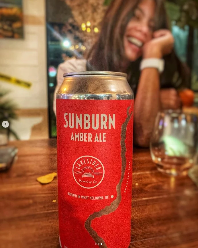
As the range grew, each beer needed its own character. Lazy Paddle, Sunburn, Beachcomber and the other labels gave us plenty of room to explore colour and illustration. But they also needed to look like they came from the same brewery.
One anchor was the round Lakesider logo. The beer names could shift to accommodate different lengths, while the brand stayed in a consistent position. The lake motif carried through the designs.
That doesn't mean every new idea gets a free pass. When we worked on Fireside Winter Ale, an early dark-blue direction felt too close to the existing Dunkel can. We explored browns instead. A colour can work beautifully on its own and still be the wrong choice beside the rest of the range.
A lizard joins the lineup.
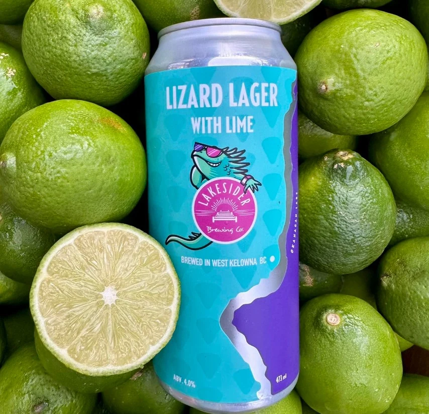
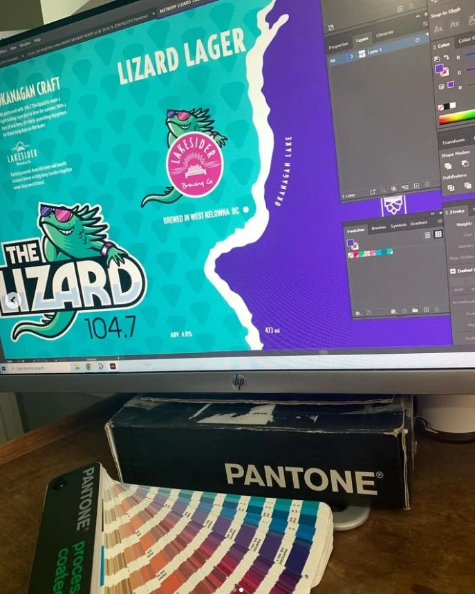
Lizard Lager brought another brand into the mix: 104.7 The Lizard. We worked with the radio team on their character and colours, while keeping the label connected to Lakesider.
There was a very practical discussion about the space around the character and logo. Adding “With Lime” helped communicate what was in the beer and gave the front of the can a better balance.
That's the kind of detail I enjoy: one change doing two jobs.
BEHIND THE DESIGN / VIDEO PREVIEW
From the screen to the shelf.
A short studio walkthrough could sit here, showing the artwork and the thinking behind it.
SAMPLE VIDEO PLACEMENT · NOT PLAYABLEA colour can work beautifully on its own and still be the wrong choice beside the rest of the range.
The work isn't finished when it looks finished.
A lot of our email history is about the things you don't see in a portfolio photograph: printer templates, metallic effects, colour values, barcodes, ingredients, proofs and files that need to be adapted to a different format.
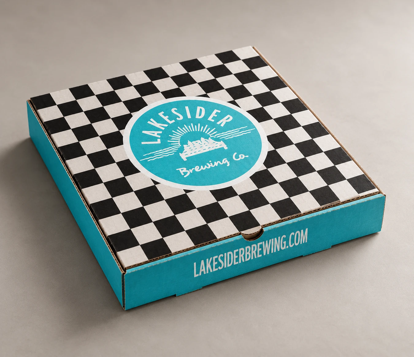
For the vehicle graphics, I rebuilt a can as vector artwork so it could be reproduced at a much larger size. For the pizza box, we worked through panel details, the supplier's template and print preparation.
When Kieren offered to bring me a pizza in one of the new boxes, I had to admit I'd already collected an empty one. It was on my studio Wall of Fame. Preferably without the pizza grease.
What this means for your business.
The useful lesson isn't that every brand needs a lake, a lizard or a pizza box. It's that your identity needs to work as a connected system—and survive being produced.
Before signing off on your next piece of packaging, ask:
- Does this fit the personality we want people to associate with us?
- Can customers distinguish it from the other products in our range?
- Will it work on the actual material, at the actual size?
- Have we checked the details with the people producing it?
For me, the Lakesider story is about an ongoing collaboration: trying ideas, listening, refining and carrying the work through. The personality gets people looking. The less glamorous details make it real.
FROM THE WORK TO YOUR NEXT PROJECT
Got a brand that needs bringing to life?
Brand identity, beverage packaging and artwork ready for print.
Let's talk ↗Explore the packaging work ↗