PUBLICATION DESIGN / ARTICLE
The work behind a great magazine.
A good publication gives readers a reason to open it—and a clear path through what comes next.
BY BRENT DUCHARMECREATIVE STRATEGIST & DESIGNER
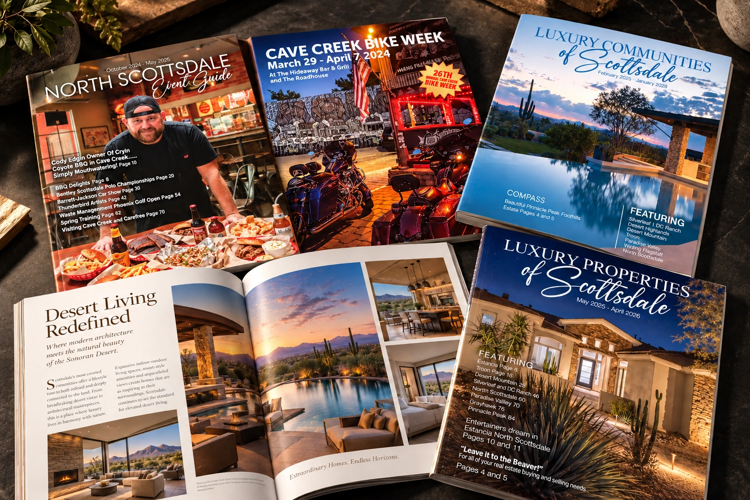
Start with the reader, not the page count.
A magazine is a collection of stories, but it shouldn't feel like a collection of unrelated files. Somebody has to decide how those stories live together: what leads, what deserves room, and where the reader needs a change of pace.
Before I start arranging pages, I want to understand who the publication is for and what it is meant to do. A member magazine, a community publication and a sales piece may all use similar production tools. They have different jobs.
For a business owner, that distinction matters. Are you helping customers understand something? Building a relationship? Showing the depth of your expertise? The answer shapes the design.
Consistency gives you room to be interesting.
The unglamorous part of magazine design is building a dependable structure: margins, columns, heading styles, captions, page numbers and a clear type hierarchy.
Once that structure works, individual stories can have personality. A feature might open with a big photograph. A practical guide might need a diagram and short sections. A profile might begin with a line that makes you curious.
Consistency doesn't require every spread to look identical. It means the reader understands the publication even when the pace changes. Without that foundation, each new article feels like arriving at a different website.
The words and pictures need to work together.
A powerful photograph can carry a spread. A weak one cannot be rescued by making it enormous. Sometimes the right decision is a smaller image, a tighter crop or asking for a better source file.
The same is true of copy. A headline may fit physically and still say very little. A caption can explain why an image matters. A pull quote should earn its space rather than repeat the least interesting sentence in the story.
Layout often reveals editorial problems. If a page feels crowded, the answer may be fewer words. If a story lacks a clear entry point, it may need a stronger introduction.
Then it has to survive production.
The finished PDF is only useful if it is prepared for the way the publication will be produced. Image quality, bleed, colour settings and the printer's requirements all need attention. So do the less exciting checks: correct names, consistent dates, working links and readable small text.
Proofreading and production checking are different tasks. Both deserve time in the schedule. A beautiful layout doesn't make a wrong phone number less wrong.
What to prepare before you hire a designer.
Bring a clear purpose, an audience, a rough content list, a realistic deadline and the best original images you have. Ask the printer about the finished size and production specifications early.
If the publication will repeat, agree on a process for submitting copy, reviewing layouts and approving changes. That process is part of the product.
A great magazine should feel effortless to read. Getting it there takes a surprising amount of deliberate work.
YOUR NEXT PROJECT
Let's talk about what you need.
Creative strategy, design and the work needed to make it real.
Let's talk ↗